In Opus 10 and earlier, toolbars were controlled globally - if you turned on a toolbar in one Lister, it turned on in all Listers. It was possible using the internal Toolbar command to override this and open a toolbar locally in a single Lister, but this was awkward and clumsy - and it wasn't possible to do the reverse of closing a global toolbar in a single Lister.
In Opus 11, toolbars are now local to each Lister by default. When you turn on a toolbar in a Lister it only turns on in that Lister - other Listers are unaffected. The toolbars that a Lister displays by default are stored in what is known as the Default Toolbar Set - this is used whenever a Lister doesn't have its own set of toolbars defined in the Layout it came from. Use the Settings / Toolbars / Set As Default Toolbar Set command to update your default toolbar set.
You can define Toolbar Sets which contain one or more individual toolbars.

These sets can be turned on or off in the same way individual toolbars can be. When you switch from one set to another Opus works out which toolbars (if any) are common between the sets and leaves those unaffected.
When saving a Lister Layout the current toolbars open in each Lister are also saved, and when the layout is loaded there is now the option to use the toolbars saved within the layout instead of the default toolbar set. Additionally, when creating a Lister Style you can now configure it to turn on a specified toolbar or toolbar set.
The Folder Formats system now lets you specify a toolbar or toolbar set that is to be turned on whenever that format is in use.
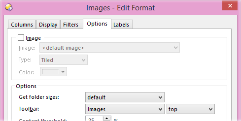
For example, you can configure Opus to automatically turn on a toolbar whenever you navigate to a certain folder, or to a folder containing predominantly a certain type of file. When you navigate away from that folder the toolbar or set is automatically turned off again.
Similarly, you can configure a toolbar or set that will be automatically turned on whenever the file display is set to the specified view mode.

By default Opus 11 uses this to show the Images toolbar whenever the file display is set to thumbnails mode.
In Opus 10 and earlier, if a toolbar was open in a Lister it could not be floated, and vice versa. In Opus 11, floating toolbars are completely independent of Lister toolbars - you can have the same toolbar open in a Lister and floating on the desktop. You can also float the same toolbar multiple times if desired.
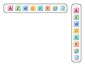
For example, you could put the same floating toolbar on each monitor in a multiple monitor system. Each instance of the floating toolbar will remember its position and orientation. Because each instance can be configured separately several options relating to toolbar appearance have been moved from the Customize dialog to a new menu that is accessed from the toolbar itself.
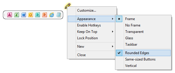
In Customize mode the edit button will appear at the top-right of the toolbar when you move the mouse over it. Click the button to display the menu that lets you change things like frame type and whether hotkeys are enabled for the floating toolbar (they are disabled by default for floating toolbars in Opus 11).
The Customize / Toolbars page now has an option for each toolbar to always enable its hotkeys in Listers. If this option is turned on a toolbar's hotkeys will always be active in Listers whether the toolbar itself is turned on or not. In a new install this option is enabled by default for the Menu and Operations toolbars (so that, for example, pressing Ctrl+A will always select all files, even if the default Menu toolbar has been turned off).
Toolbar buttons and hotkeys could previously only specify a single key sequence to launch the function. In Opus 11 you can define multiple independent keys that run the same function (e.g. Alt-D and F4 can now both activate the location field, the same as Explorer).
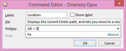
You can also define multi-key sequences (e.g. you could define a hotkey that uses Ctrl-F1, 1 as a multi-key sequence, meaning you would need to push Ctrl-F1 followed by the 1 key to launch the function).
You can now configure things like the background image or color, image and label state and font size and style for context menus.
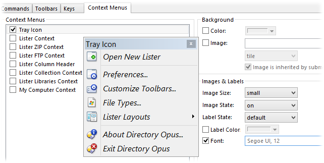
The Context Menus tab in the Customize dialog now has the same set of controls as the Toolbars tab letting you make these changes in the same way as for toolbars.
You can now configure toolbar buttons that change their icon dynamically based on a Set command clause, with the new @icon command modifier.


For example, the default View Mode Cycle button now changes its icon to reflect the current view mode.
There is now the option to hide the drop arrow on drop-down buttons. A single click on the button will run the button function as normal. To display the drop-down menu when the arrow is hidden, you can either click-and-hold (for about half a second) on the button, or click it with the right mouse button.
The @toggle directive has been expanded to allow the checked state of a button to be dependent on one or more Set command clauses.
The new Label button type is similar to a Spacer in that it pads out the toolbar (by a fixed amount or right-justified), but it can display a text label instead of empty space.

The default Images toolbar uses one to label the Rotate buttons.